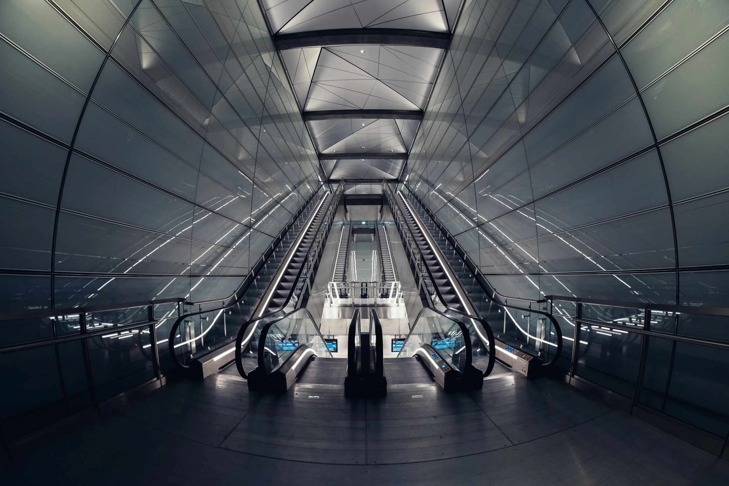
Copenhagen Metro M3
There are a lot of good things to be said for the M1 and M2 Metro lines in Copenhagen. They're frequent, efficient, and generally punctual. One thing that cannot be said about them, however, is that they have interesting looking stations. This has been the one thing that I've always disliked about the Copenhagen Metro. The architecture is drab and grey, with no thought given to how the underground should be tied together with the areas above ground, or how to make them aesthetically pleasing.

Nørreport Station (left) and Forum Station (right) along the M1-M2 line
Look at our Scandinavian siblings in Stockholm and Oslo, where their underground transportation systems feature vivid and interesting architectural features, some of which are artworks unto themselves.

Stadion Station in Stockholm (left) and Løren Station in Oslo (right)
But with the new M3 line, Copenhagen is finally rising above the grey. This time a conscious decision has been made to not just tie the underground and overworld together, but to give each station a distinctive look while still making sure there are enough common elements to tie the whole line together. As ever, I was skeptical, but October 1st 2019 I spent 3 hours at night travelling the line and taking photos. And after that little nighttime adventure, I can safely say that the Copenhagen Metro can now stand alongside its counterparts in Scandinavia without looking like it got left behind.
This series of photos is dedicated to my dear friend Søren Thuesen, who we sadly lost to cancer earlier this year. He was one of the driving forces that got me into photography, and especially these sorts of ultra-wide symmetrical architectural shots. Wish he could’ve been here to shoot this series with me.


